Blog Redesign

01 Project Brief
United States Pharmacopeia needed to redesign their blog, Quality Matters, to match their newly launched website and to meet the following goals:
- Increase awareness of USP’s mission and impact
- Increase visibility of depth and breadth of topics covered
- Engage more people, both readers and contributors, in supporting USP
Targeting to launch in a month, easy development also need to be taken in consideration.
02 My Role
I was the UX designer for this project and responsible for creating wireframes, prototypes, and presenting them to the client. I also needed to document the UIUX specifications, and hand it off to the development team. I collaborated with another designer on the visual design.
03 Approach
Redesigning this blog required me to take into consideration the 3 different end users:
1. Readers
Engaging design and effortless navigation
2. Contributors
Promotion and recognition for their articles
3. Blog Managers
Easy, simple, and straightforward to maintain
I presented these two solutions for the home page:
Left
- Resemble the main site (usp.org)
- Content is categorized into rows, displaying the vast coverage of topics
- The repetitive layout is to provide a consistent user experience.
Right
- Display multiple topics in the header (showing USP's diversity)
- Incorporate a smart filter for recent blog entries (easy for readers to explore)
- The layout is dynamic by rearranging the containers
On both concepts, all the images has the same ratio (easy to manage)
The right one surprised them and exceeded their expectations. Using the home page as a guide, I produced the rest of wireframes including the topic page, the list of contributors page, the contributors detail page, the video page, the blog detail page, and the search result page.
I reused the home page design for the topic page (and the tag page), which gives each topic and tag the same compelling look as the home page.
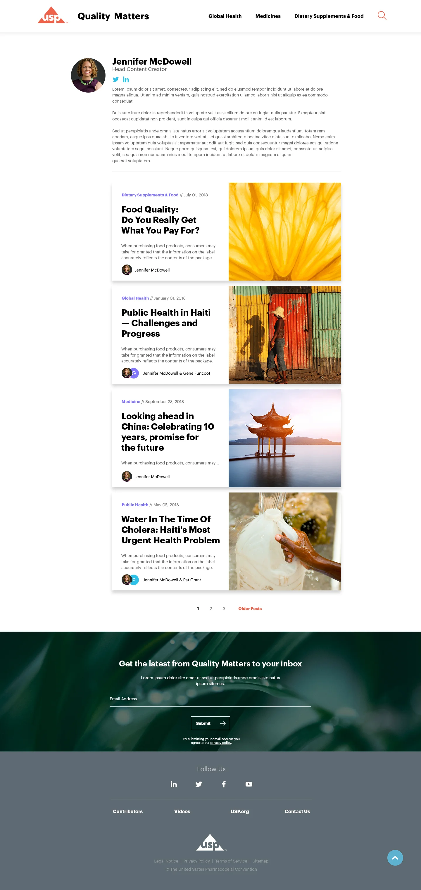
To promote the writers, I designed profile cards which feature their short statement, social media, and other articles by them. These cards are displayed in the right column of the their articles' detail page, and also used in the list of contributors page.
While I was working on the sub page wireframes, my colleague worked on the initial UI design for the home page. I provided feedback and helped to finalize the design.
Home page
Mobile interface


