Reimagine Mobile Navigation

01 Project Brief
Tufts Health Plan is a prominent health insurance provider with millions of subscribers.
They have a content-heavy website with a complex navigation: there are 5 different user groups, and each group has its own menu. Users can belong to more than one group.
The goal of this project is to improve the mobile navigation experience, so users can easily navigate through the sea of content and quickly find their information.
02 My Role
I was the lead UX and UI designer and responsible for ideation, creating prototypes & visual design, presenting to the client and handing the design off to the developers.
03 Pain Points
Original navigation required users to close out of the mobile menu to change their group.
It required a full page refresh to access sub-navigation items.
Utility items, such as "Contact Us", were missing in the deeper levels of the mobile menu.
Users had no understanding of which user group information they were reading.
04 Solutions
I began by researching many case studies and articles on the matter (I found this one extremely helpful), and looking at other websites that had a similar information architecture (For example, many department stores have multiple product categories, and a user may browse multiple categories at once, such as women and beauty, or men and gifts).
Keeping the pain points in mind, the solution needed to be :
- Scannable
- Scalable
- Informative
- Navigable
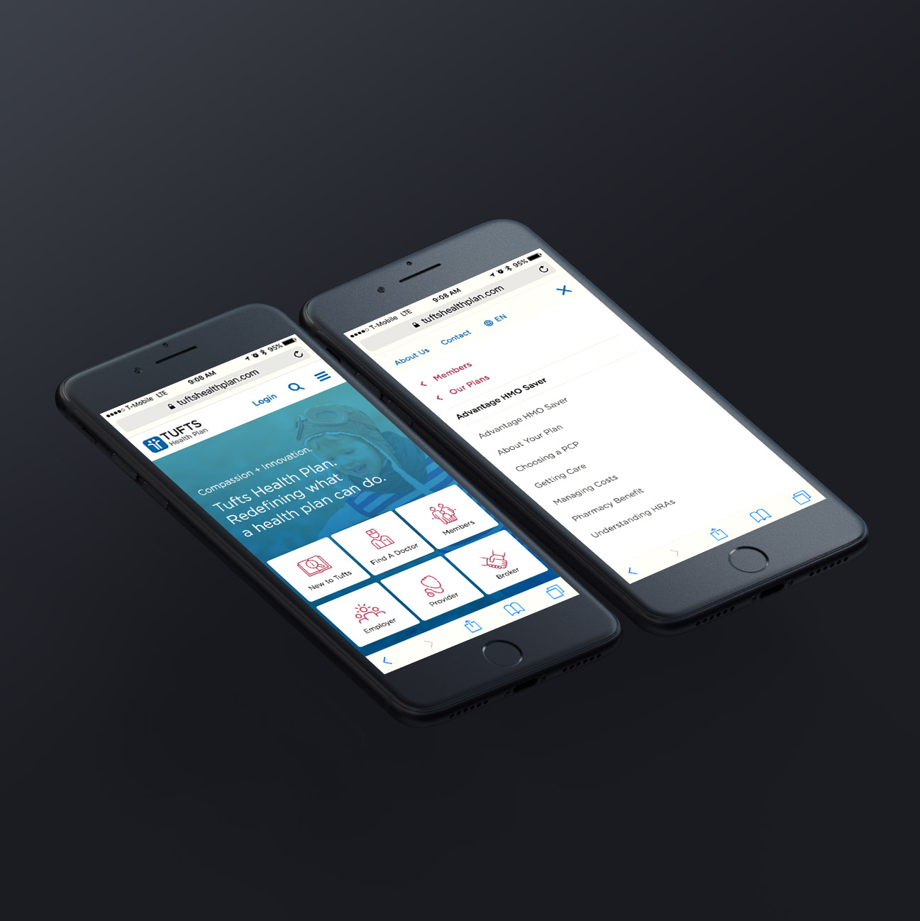
My solution was to use accordion menu for the top level and a "breadcrumb" for sub levels. For Breadcrumb allows users to understand the hierarchy of the current page in relation to the website's structure.
For the UI, I changed the background from blue to white, so it allowed me to use colors to differentiate actions and create visual cues.
Here are 3 user scenarios, and how this solution would effectually to achieve their goals:
Group 1: Go to the home page with the intention to learn more about the product
The scannable accordion menu allows them to select their user group, and land on the its product page.
Group 2: Go to the website with a specific need
The breadcrumb style keeps each menu relatively short and allows them to quickly find the information, and jump around the site with just a few clicks.
Group 3: Landed on a page through search engine
Breadcrumb menus allow users to understand the hierarchy of the current page in relation to the website's structure. It keeps them informed about their current "location" relative to the website, and what user group information they are reading about.
Beyond the mobile menu, I also suggested following changes:
Home page
I redesigned the mobile home page by putting the 6 primary user goals on it.
The sticky nav
I removed the logo and the user group selector from the sticky navigation (logo is still on the initial navigation bar, see home page). The logo took up a lot of precious space, but it's function of always returning back to home page was not friendly for all the user groups. It’s branding purpose could be achieved in other ways.
The footer
I redesigned the footer to be more finger friendly, and to look cleaner.
05 Execution: Prototype
The prototype was developed for the client to test the new design on their phone. Testing was successful, and changes were implemented to the site.
You can play with the prototype below or open it in a new widow (recommended).
NOTE: Only certain items are clickable. To see what is clickable, click in the middle of the screen, and clickable items will highlight in yellow.


