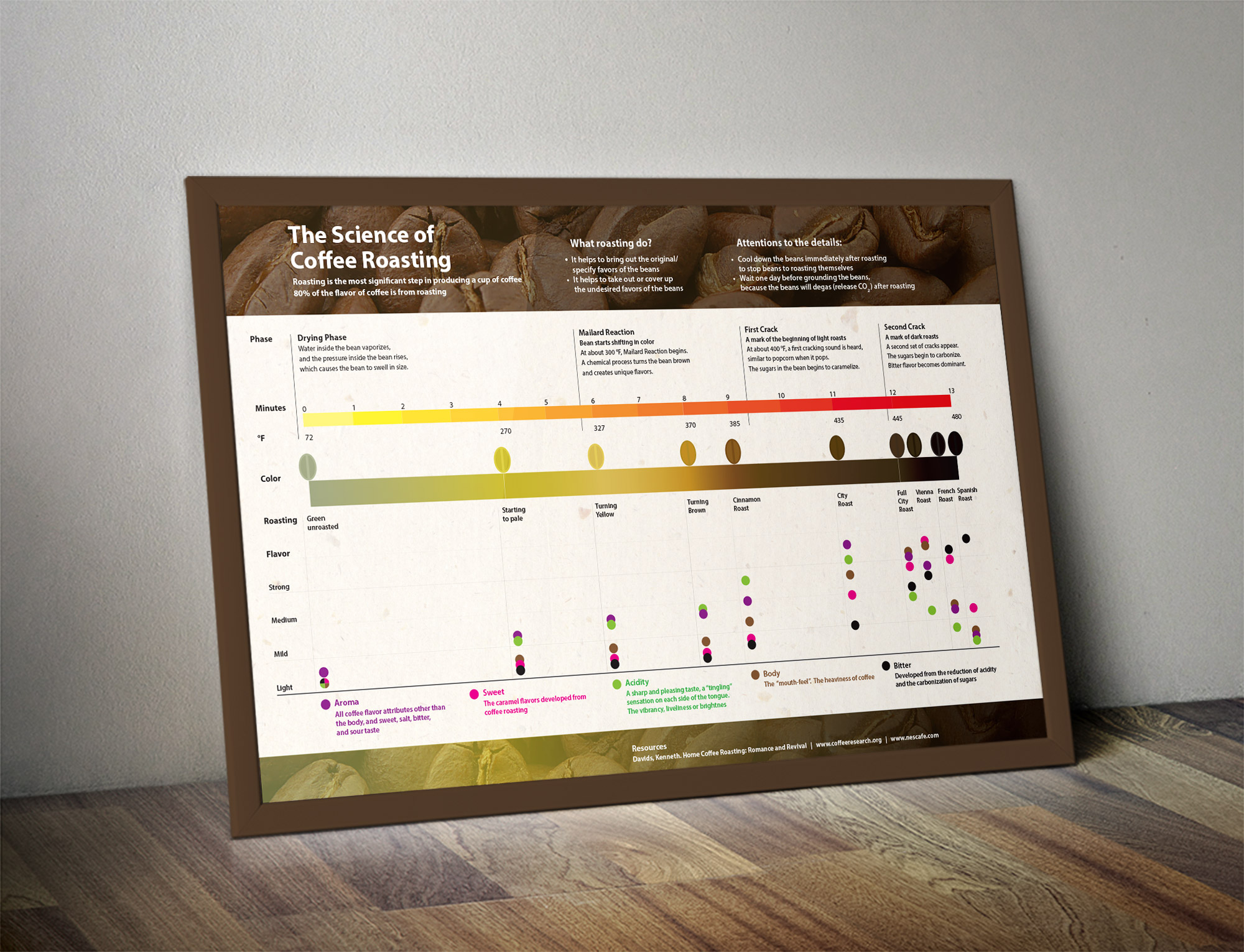
Editorial Design

Positive/Negative Magazine is an annual publication created solely by Rochester Institute of Technology in the College of Imaging Arts and Sciences. The articles are created in collaboration between one designer and one photographer. The theme of volume 8 is "stream consciousness", and all the articles are expressing either positive or negative opinion towards a topic.
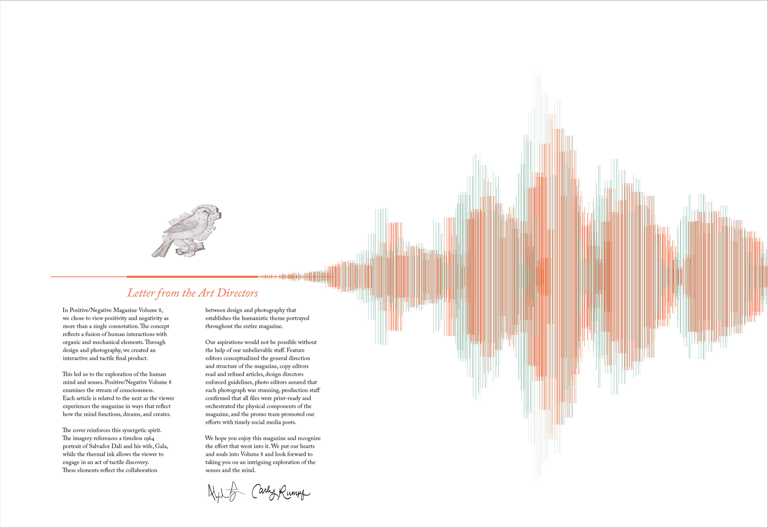


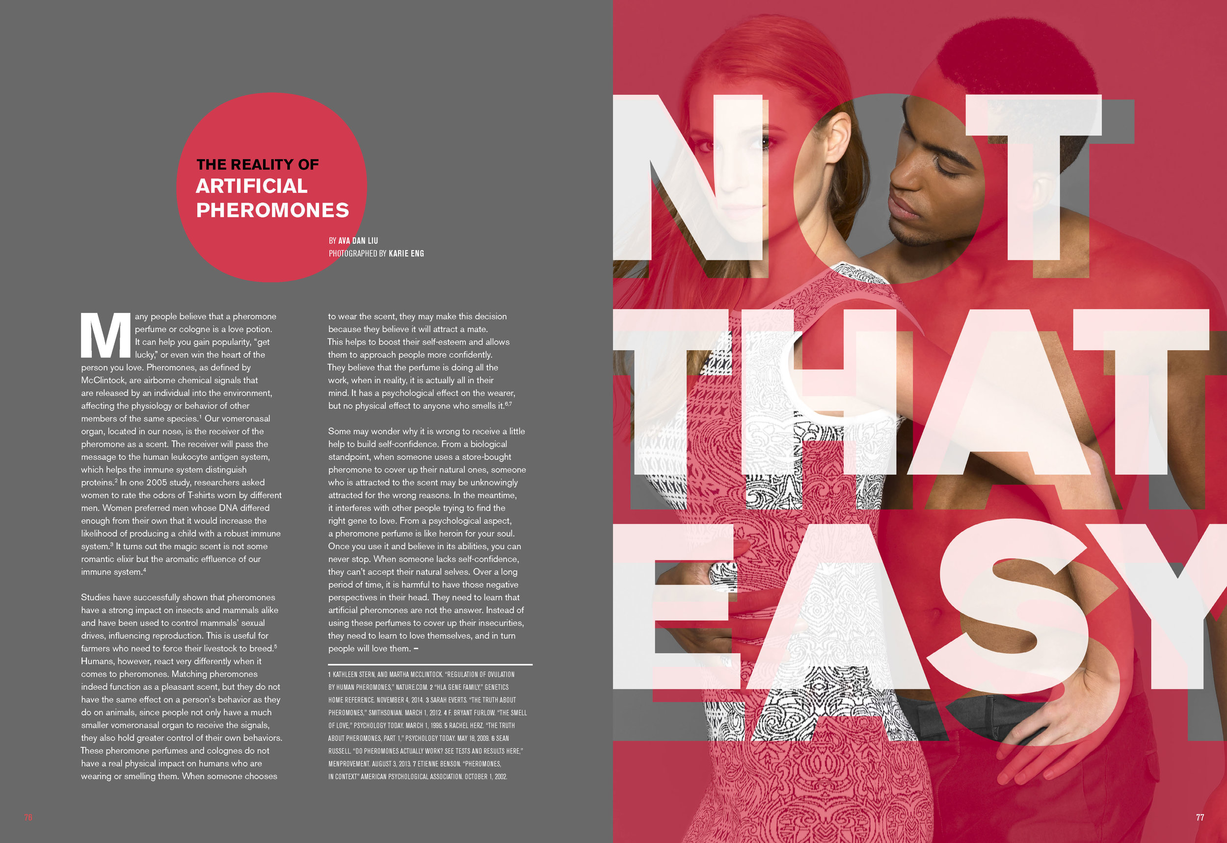
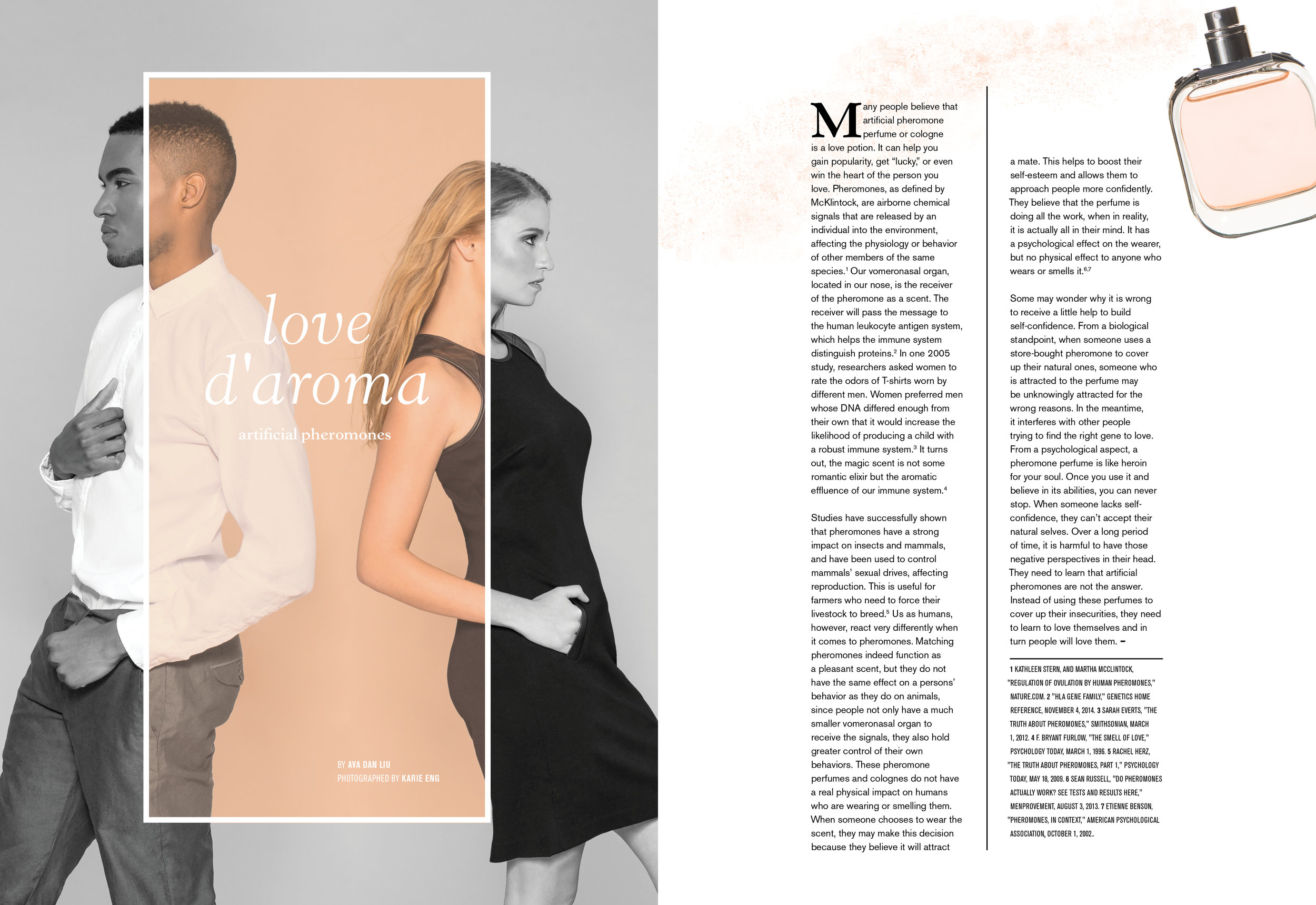
All these articles are published in Positive/Negative Magazine Volume 8.
The magazine introduces the theme of stream of consciousness by opening up with the five human senses on the first five pages. The page of "a letter from the art directors" is illustrating the sense of sound.
An article about the negative influence from luxury travel. It reflects on how people rarely think about the bad side of luxury travel. The design is subtle and clever by combining the luxury look with the cunning touch of pollution. Photo by Chrissy Connors.
This article about plastic surgery in Korea discusses how its society has set standards of beauty and pushing people to all look a certain way. With precise measurements overlapping the face, text set in an grid, dashed lines resembling stitches, and color gradients that indicate change, we create a sense of artificiality. Photo by Chulho Kang.
This article is about the mystery of artificial pheromone's effectiveness to attract the opposite sex. The result is yes, but since humans have control of their own will and behavior, the attraction won't show unless it is wanted. I have created two approaches to this topic. The first is more aggressive by revealing the desire underneath bold text. The circle that the title sits in (on the left page) corresponds to the empty circle revealing the attraction between the two models (on the right page). Photo by Karie Eng.
The second approach is subtle as it imitates a perfume advertisement. In the picture, two people are facing away from each other, but actually they are attracting each other. The body text is set in two columns which are the same height as the two models. The graphic rule between the two columns implies the separation of the two models, while the perfume is trying to bring them together, like pheromones. Photo by Karie Eng.


